
React Component Library & Design System
DEVVY UI
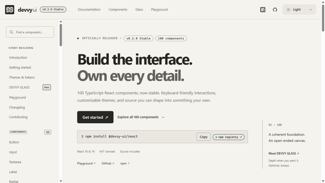
DEVVY UI is an MIT-licensed React design system by Jhet Tacalig: 100 TypeScript components, zero-runtime CSS, optional glass materials, and a source ownership CLI.
Case study
I independently created, designed, and developed DEVVY UI as the open-source design system in the DEV/STATION ecosystem. Its stable v0.2.0 release brings 100 typed React components together with documentation, themes, a playground, and a source ownership CLI.
A complete interface foundation
The library covers inputs, validation, navigation, dialogs, multi-select overlays, charts, timelines, data tables, Kanban boards, and media controls. Components support React 18 and 19, standard native attributes, keyboard interaction, and customization through classes and design tokens.
Ordinary CSS, without a styling runtime
The styling layer uses namespaced dvy-* classes and --dvy-* CSS custom properties instead of runtime CSS generation. ESM tree shaking and individual component entry points let applications bundle the parts they use. DOM-free core utilities handle keyboard navigation and state; the React layer retains normal client boundaries and supports server rendering.
DEVVY GLASS and source ownership
DEVVY GLASS is an optional frosted material stylesheet. Teams can install the React package with npm install @devvy-ui/react, or copy canonical component implementations into their own projects with npx @devvy-ui/cli add button. The CLI also provides init and doctor commands, resolves shared dependencies, and protects local edits.
Six packages, one independent project
The v0.2.0 release is distributed through six MIT-licensed @devvy-ui packages: react for components, core for DOM-free behavior, tokens for themes, styles for CSS and glass materials, registry for canonical source snapshots, and cli for source installation. The documentation includes installation paths for Next.js App Router and Vite.
Explore the live documentation and component catalog at devvy-ui.dev-station.dev/ui.